wEBSITE REDEISGN


Our client, an early-stage startup, sought to transform healthcare communication nationwide with their platform, At Their Side.
Background
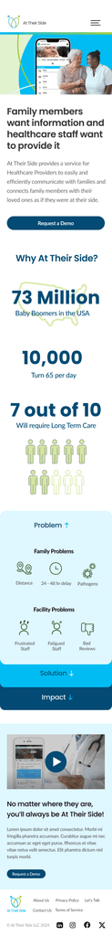
At Their Side offers healthcare providers a streamlined way to communicate efficiently with patients' families. A website redesign is needed to effectively convey information about the service and its app.
Task
Redesign of At Their Side website
Create clean & creative site that will legitimize and accessorize product
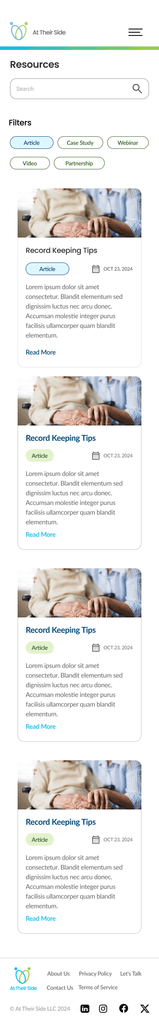
Add resources and a news tab
Add the ability to request a demo
Highlight key features and assets of the product
I've detailed the project's step-by-step process, including research, planning & design
Research & planning
Identify the most effective ways to convey the At Their Side app and its’ benefits, ensuring potential users quickly grasp the app's purpose and value
Assess and improve the site navigation, making it easy for users to take action (demo requests)
Explore design and content strategies that help establish trust with families and providers
Design
Collaborated on creating logo, intuitive user interfaces and refining designs iteratively based on user feedback to improve usability and visual appeal.
To uncover the problem I began by conducting research
Key findings
Heuristic evaluation of the interface. Our analysis revealed a few critical issues that impact usability and overall user experience. Firstly, there are navigation labels that lack clarity, making it difficult for users to understand where each link will lead them. This issue falls under the 'Help & Documentation' heuristic because unclear labels can lead users to miss critical information.
Heuristic evaluation
Competitive analysis
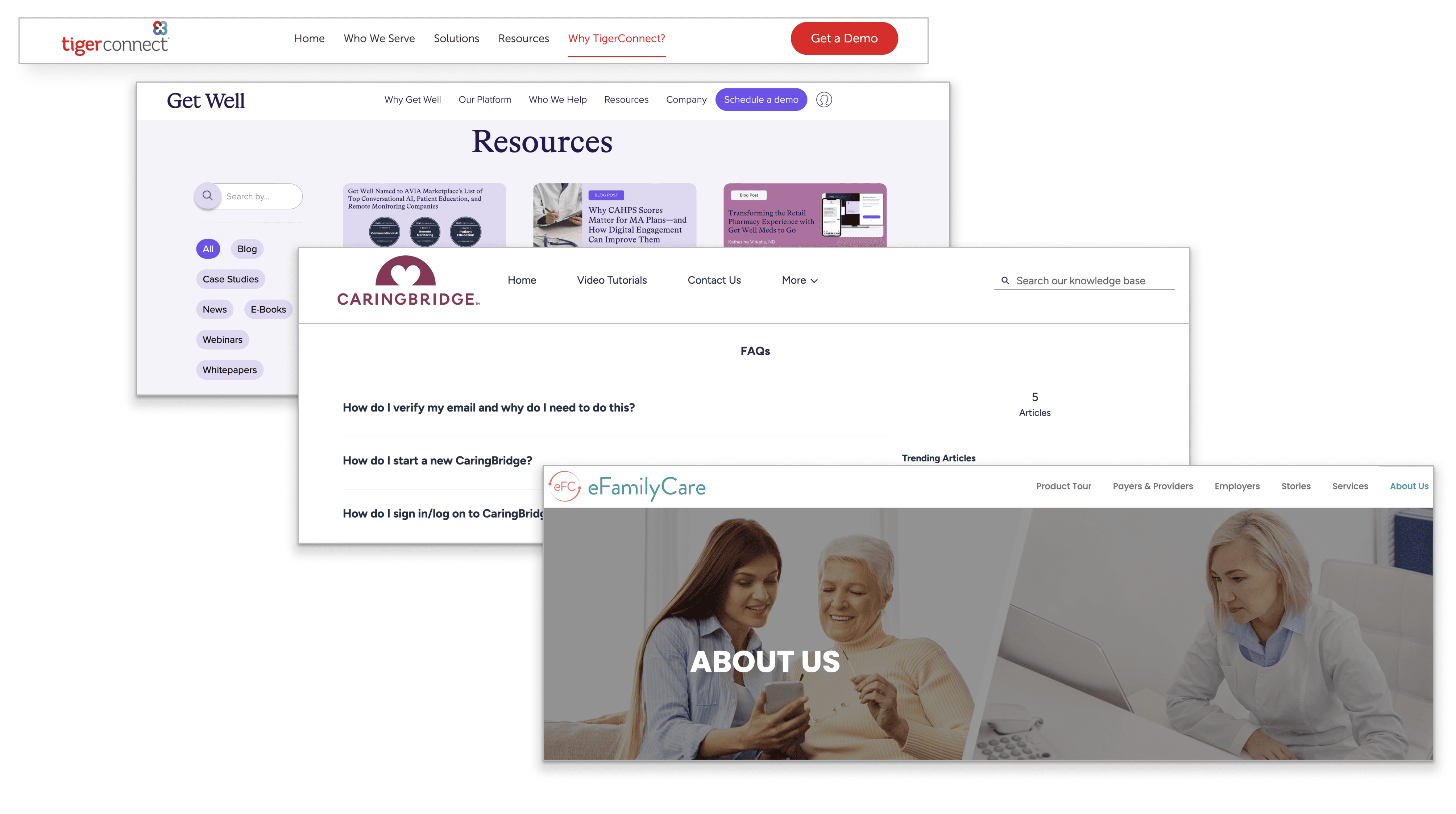
We conducted a competitive analysis, revealing that At Their Side lacks key features like Help and FAQ sections. We compared At Their Side to several other healthcare websites such as, MyChart by Epic, Athenahealth, and Meditech Expanse.
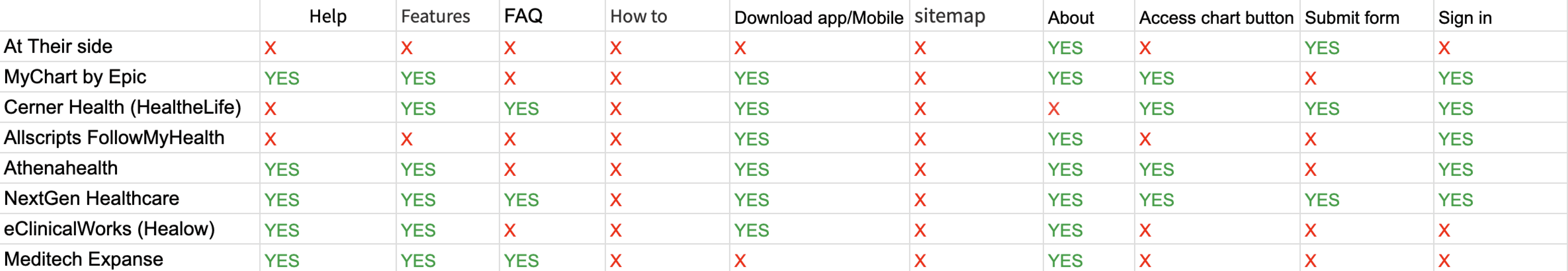
Missing key features
Our client requested the additional pages for resources, news, FAQ and stories. Below are some examples of our competitors resources, FAQ, about us page and "request a demo" button.
Usability interviews
Questions
We interviewed 4 people in the healthcare industry with 4 different tasks.
• The first question was "What do you except to find?"
• The second question was "How would you request a demo?"
• Third question was "Can you locate info on the founder and CEO?"
• The fourth question was "Could you locate key features of the product?"
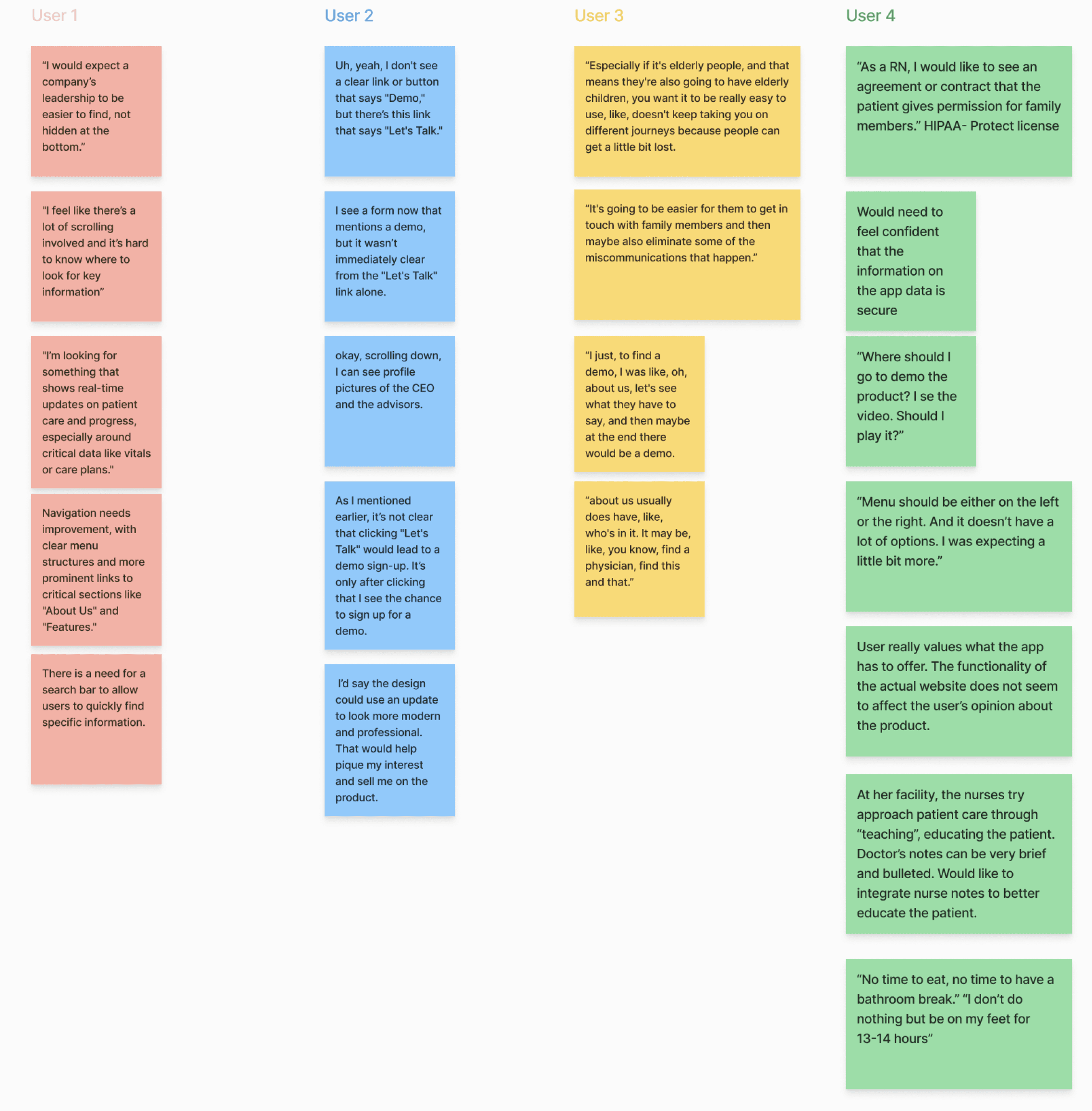
Quotes
"I see a form now that mentions a demo, but it wasn’t immediately clear from the 'Let's Talk' link alone."
"Would need to feel confident that the information on the app data is secure"
"You want it to be really easy to use, like, doesn't keep taking you on different journeys because people can get a little bit lost."
After completing our research, we synthesized the findings to uncover key insights.
Personas
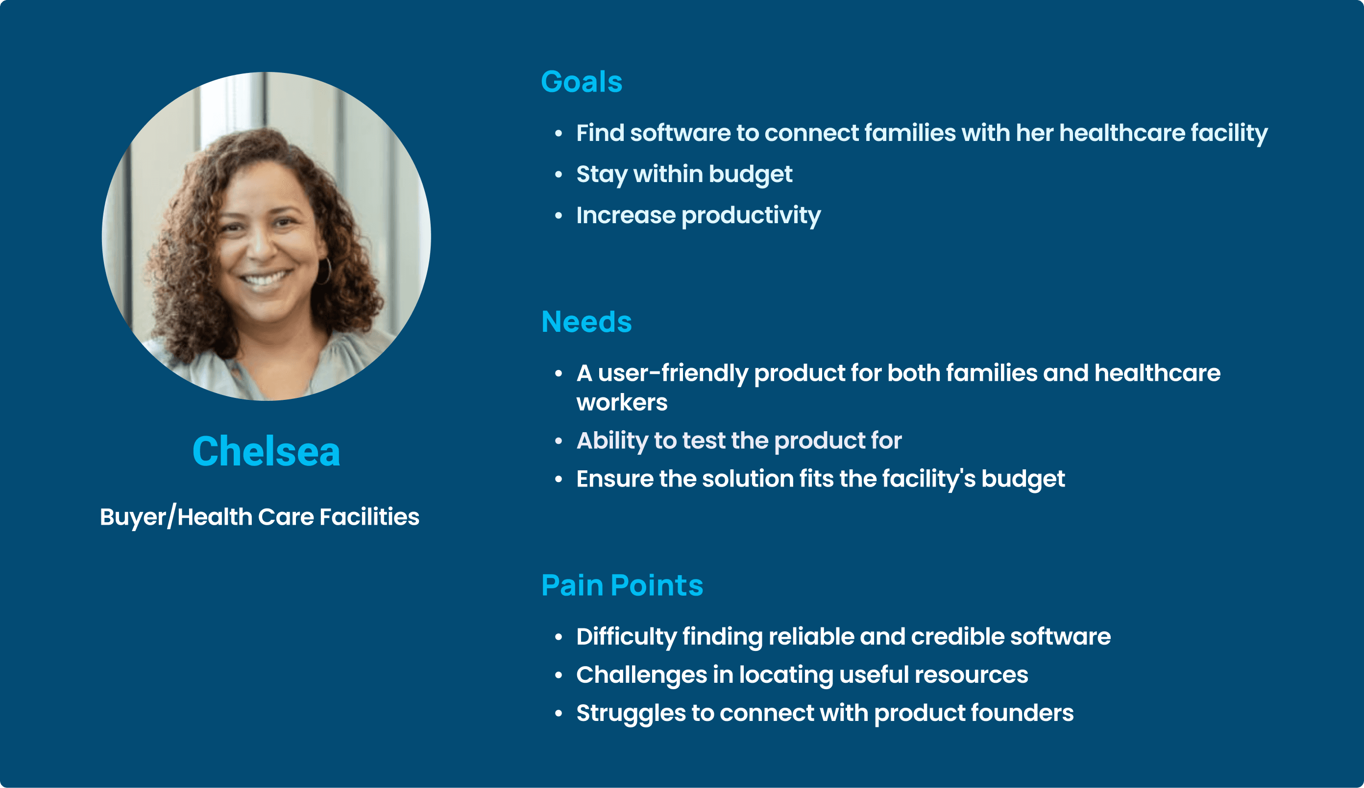
We created 2 personas: Chelsea, a buyer/healthcare facilities administrator. Her goal is to find software to connect families with her healthcare facility while staying in budget. Her needs are to find a user-friendly product for both families and healthcare workers. Her pain points are difficulty finding reliable and credible software and struggles to connect with product founders.
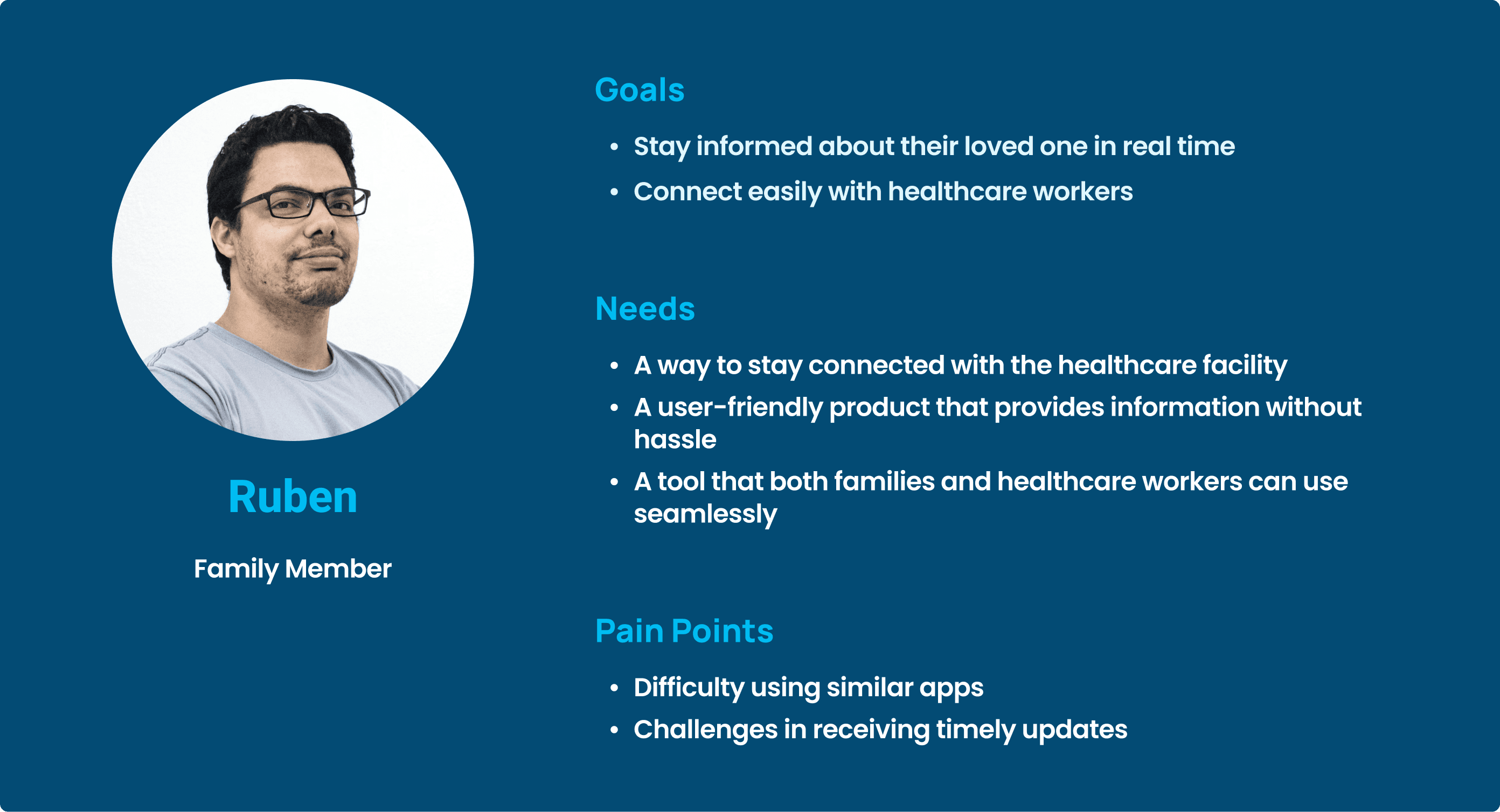
The second persona is Ruben, a family member who's goal is to stay informed about his loved one in real time and to connect easily with healthcare workers. He needs to find a way to stay connected with the healthcare facility. His pain points are difficulty using similar apps and challenges in receiving timely updates.
Personas
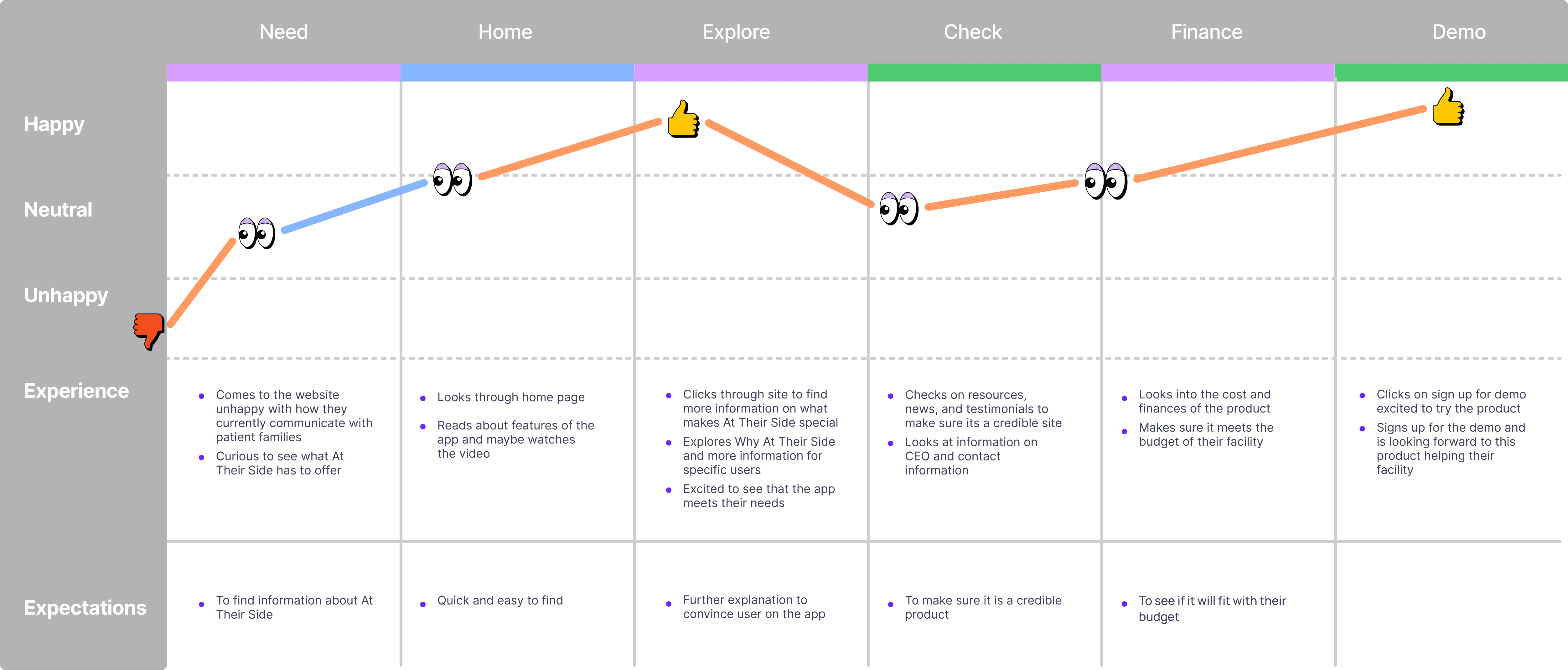
User journey map
We made a journey map to follow the ideal user experience of our personas. Starting from someone who is unhappy with how the communication of their long term facility is going onto them gaining information through the home page and seeing how it fits their needs. Then looking through about us, resources, and news to see if At Their Side is credible finally leading them to sign up for a demo.
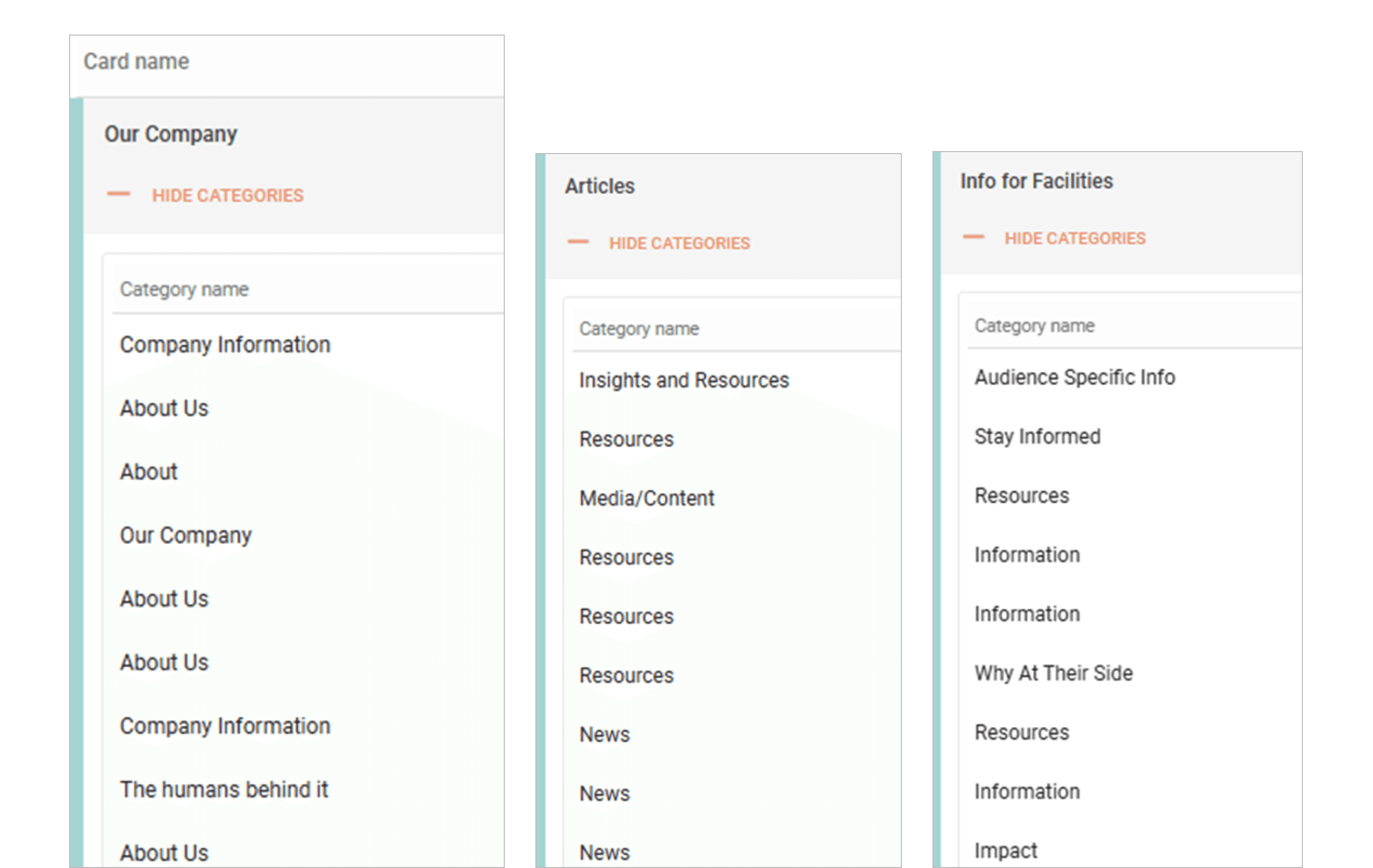
Open card sort
9 participants were asked to organize 15 cards into categories that make sense to them and create their own labels.
• Our Company
• Support
• Info for facilities
• Stories
• Why At Their Side
• Financials
• Info for families
• Our Team
• Resources
• FAQ
• Articles
• Help
• About Us
• Info for healthcare professionals
• News
There were common patterns in the groupings
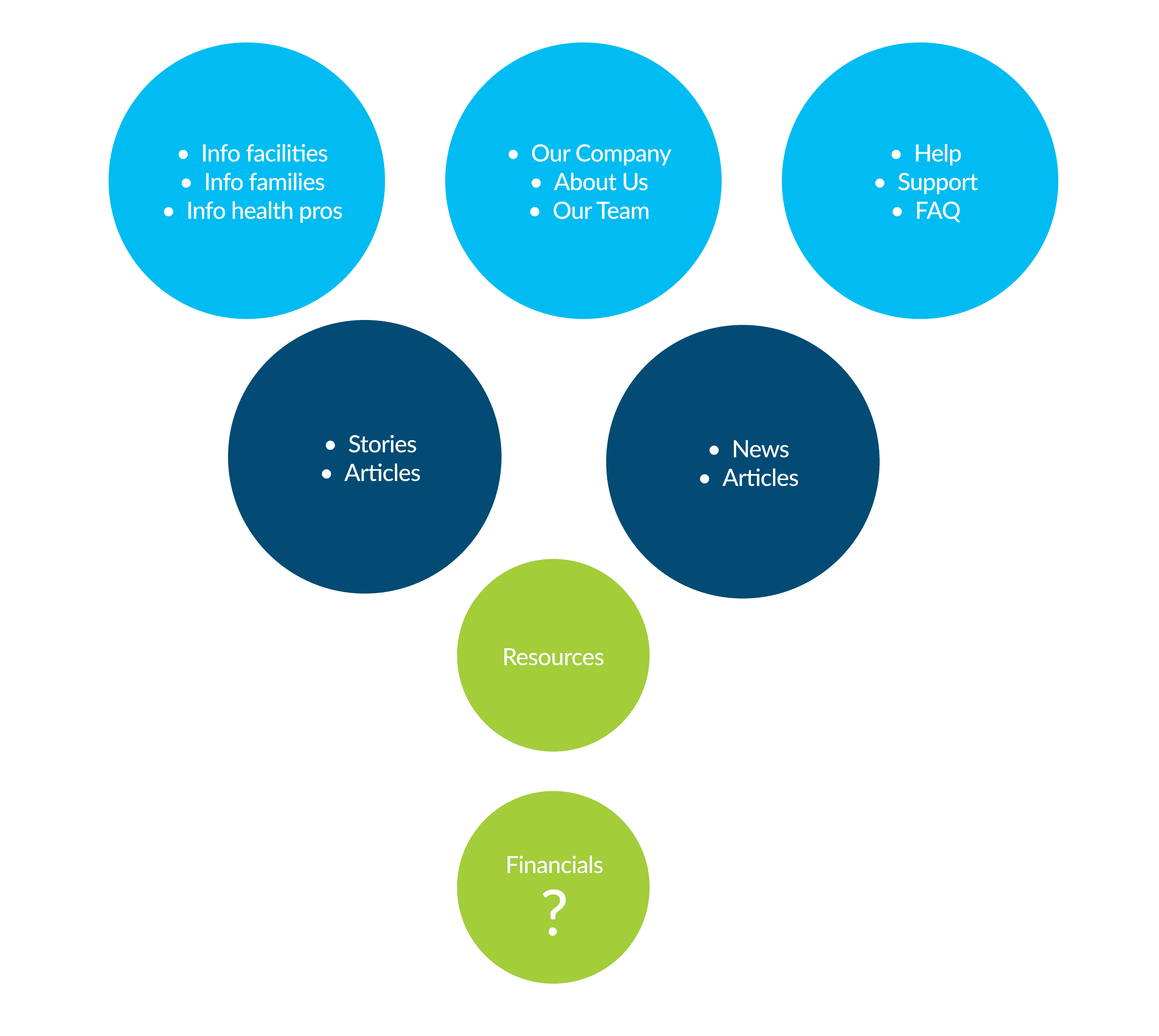
More card sorting
There were also common patterns in the labeling of the categories.
• About Us
• Resources
• News
Problem
As a buyer, we need a better way to understand, gain information, and connect with the At Their Side product because currently that information is not easily accessible.
With our research synthesized and the goal or our research realized we went on to the initial design phase.
Questions
• The first question was "What do you except to find?"
• The second question was "How would you request a demo?"
• Third question was "Can you locate info on founder and CEO?"
• The fourth question was "Could you locate key features of the product?"
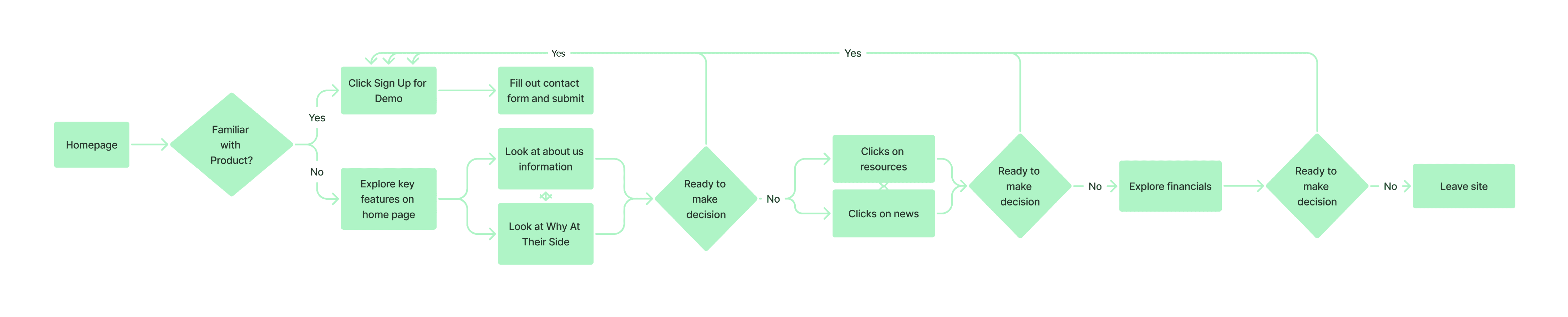
User flow
Our user flow follows a similar pattern where the main goal of each page is to lead you to sign up for a demo
Sketches
We each sketched out how we envisioned the home pages and all came up with fairly similar ideas but it came down to what did we want to show on our home page and what we wanted to break out on separate pages
With that in mind we sketched our about page which we knew would be essential especially when featuring Emily and the rest of her team. We knew we wanted this page should show the years of experience and credibility the ATS team had.
We also sketched out various other pages like the demo, resources, and why at their side page which we ended up incorporating in our home page when we started wireframing.
Wireframes
We focused on enhancing the user experience across the site by addressing key areas based on our research and insights. For navigation, we prioritized consistency across all pages and included a prominent, bold "Request a Demo" button inspired by competitive analysis. This ensures easy access to key actions while maintaining clarity.
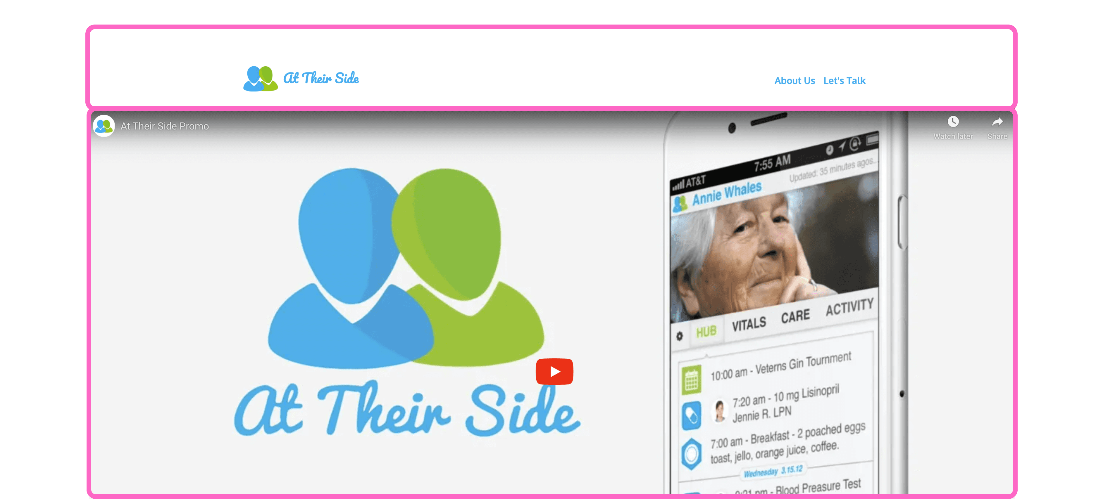
On the homepage, we integrated the original video with added context to emphasize its importance. We also relocated the "Why At Their Side" section to the homepage, incorporating detailed content from Emily's pitch deck to provide a stronger value proposition.
Modifications included:
Dedicated sections for official Vision and Mission statements.
A full bio feature to replace buttons for improved readability.
A Featured/Awards and Recognition section to build trust and credibility.
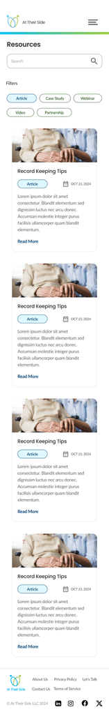
For the Resources page, we introduced a filter and search functionality to help users easily locate content, alongside visually appealing and informative cards for quick previews.
The redesigned Sign-Up for Demo section now features a promotional video on the left to visually engage visitors, while the form on the right was simplified to encourage sign-ups with minimal friction.
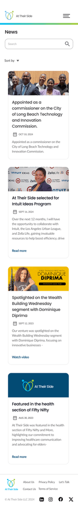
On the News page, users can sort articles by date, ensuring they can easily stay updated with the latest developments.
Overall, these changes aim to create a more streamlined, engaging, and informative site experience, effectively communicating At Their Side’s value and driving user interaction.
Wireframes
Usability Testing 2
We interviewed 5 people
Task 1: What can you learn from the home page?
Task 2: Can you find more information about the company and its founder?
Task 3: Can you find information about the companies accomplishments and what they have done?
Task 4: Where would you go to find information on long term health care facilities or case studies?
Task 5: Can you sign up for a demo?
Findings
• Navigation was comprehensive
• People could easily complete the user flow
• Demo page needs some clarification
• Cleaner design was required for users to feel more trusting of the site/product
Prototype


Here, the outcomes and achievements of the project are highlighted, including user feedback, adoption rates, and industry recognition.
Increased Efficiency
Users report significant time savings and improved productivity through optimized scheduling recommendations.
Positive User Feedback
High user satisfaction ratings and positive reviews highlight the app's intuitive interface and powerful AI capabilities.
Growing User Base
The app quickly gained traction among individuals and businesses worldwide, with a steady increase in user adoption and engagement.