ENROLLMENT PLATFORM


Class registration is often one of the most stressful aspects of college life
Background
Students often face issues like limited class availability, scheduling conflicts, and unclear prerequisites, which can lead to delayed graduations or waitlisted courses. Our goal at Class Finder is to help minimize this stress by providing a better registration experience.
I've detailed the project's step-by-step process, including research, planning & design
Research & Planning
Used various research methods such as user interviews. I created affinity maps, user personas, and a sitemap.
Design & Prototyping
Collaborated on creating intuitive user interfaces and interactive prototypes, refining designs iteratively based on user feedback to improve usability and visual appeal.
Testing
Conducted comprehensive usability testing and collected user feedback to identify improvements and ensure the design met user needs.
To uncover the problem I began by conducting research
Business Model & Research Findings
We started by understanding the business model. Class Finder primarily sells to universities, but its end users are college students. A key focus is streamlining the credit transfer process between institutions. We also explored the general class registration process.
Competitive Analysis
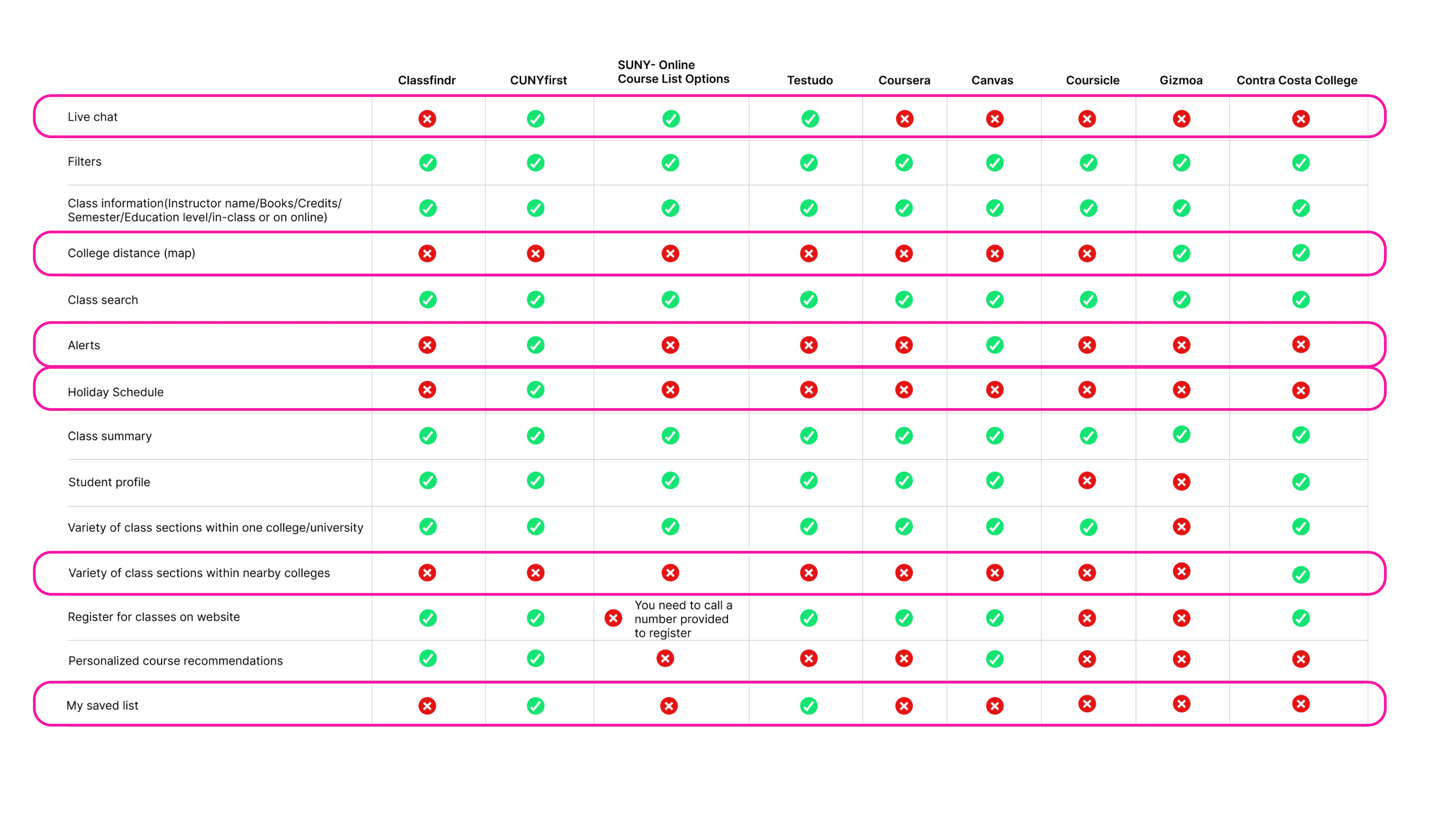
Analysis
Looking for patterns I noticed that Class Findr is lacking features:
• Live chat
• College distance
• Alerts
• Classes nearby within a 100-mile radius
• My saved list
Interviews
10 people were interviewed
100% All participants are current or former college students with class registration platform experience
100% have had an issue with the platform they used
20% delay their graduation due to scheduling issues
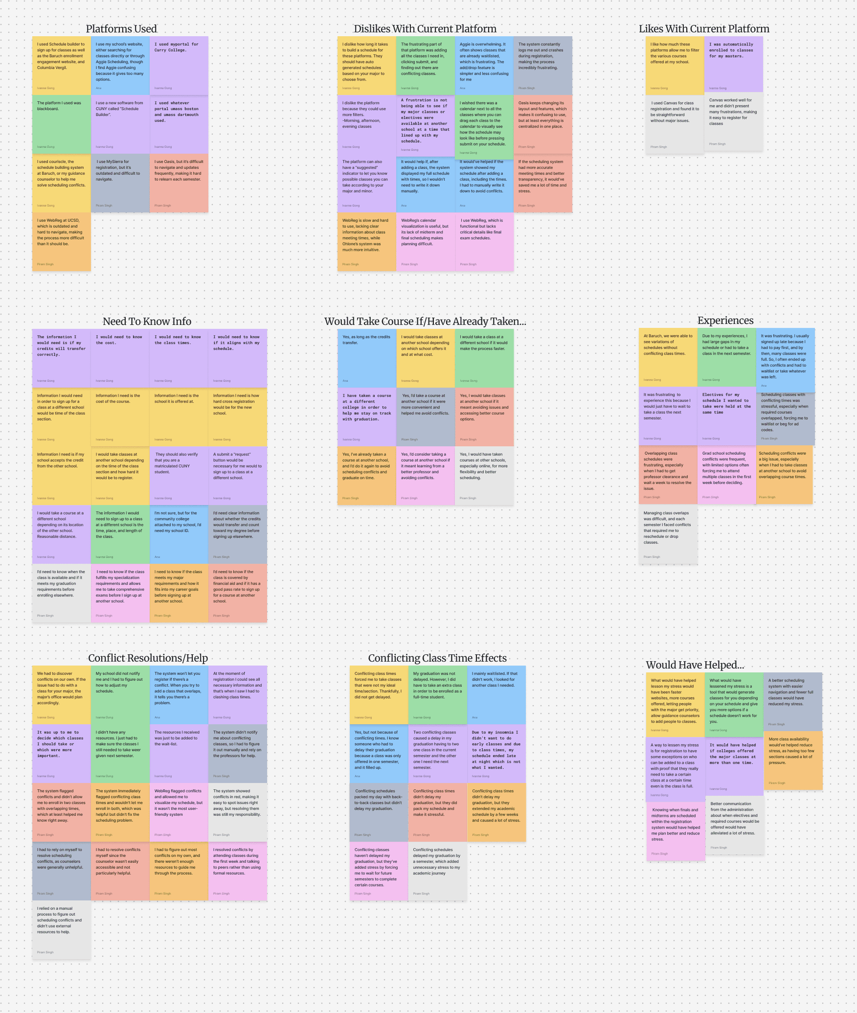
Research & Planning
Conducted an affinity map to identify patterns. Understanding our users’ needs even more so through conducting an affinity map, we were able to see that our users needed the following:
User needs
Pre-made schedules according to their student accounts
Class availability per semester at primary college
Location of other colleges
No conflicting class times
Show classes available in other schools
Show credits that will transfer
Affinity map
Findings
Looking at the data we have uncovered the problem.
Problem
Students need a better way to schedule classes without time conflicts, ensuring they can stay on track for their planned graduation timeline.
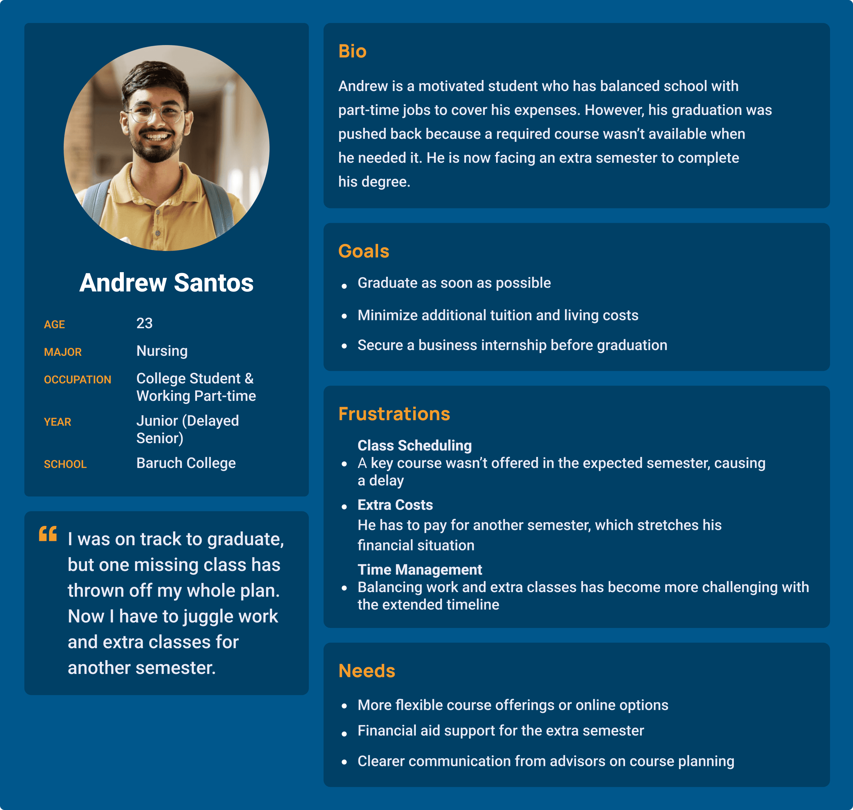
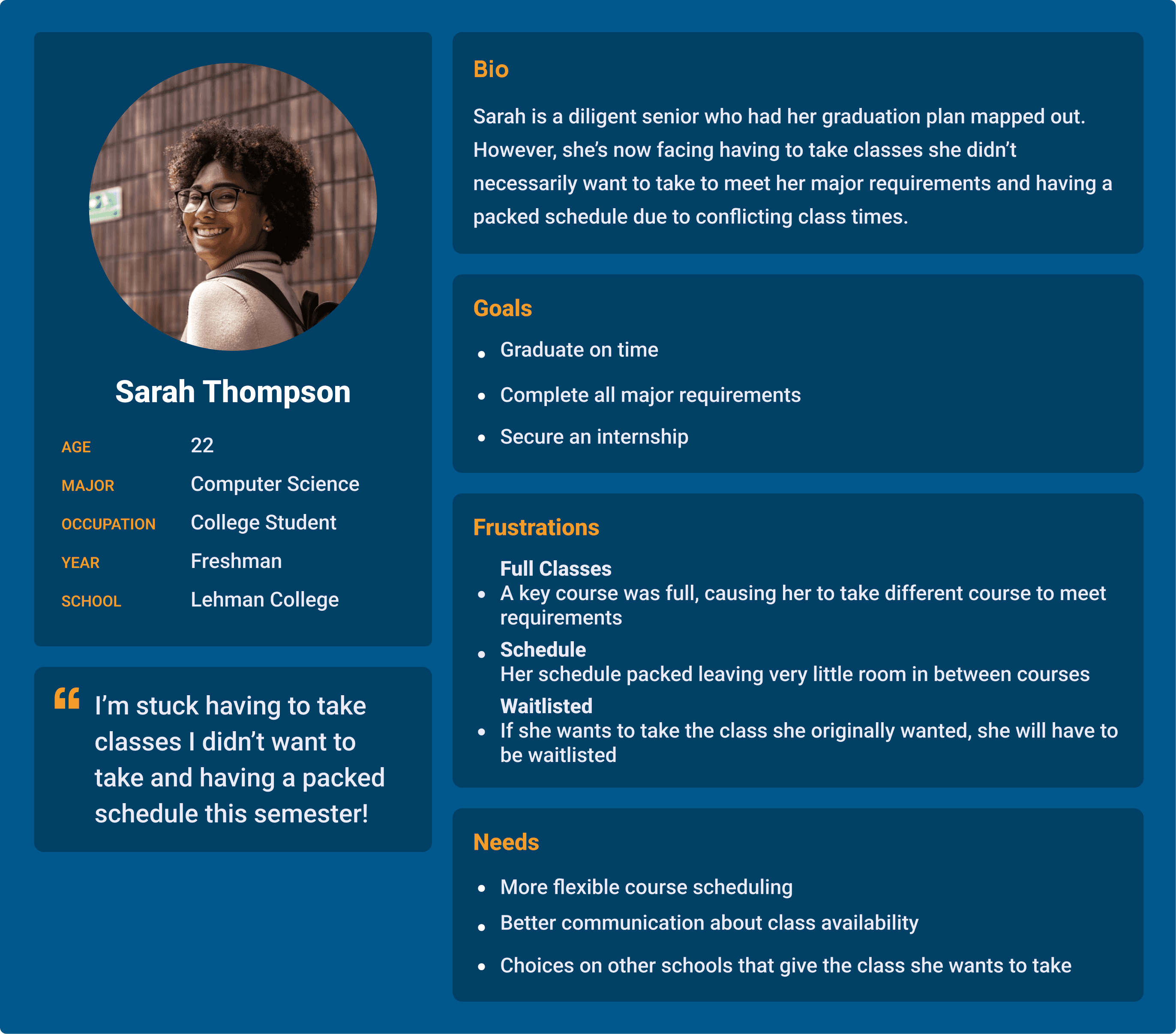
Personas
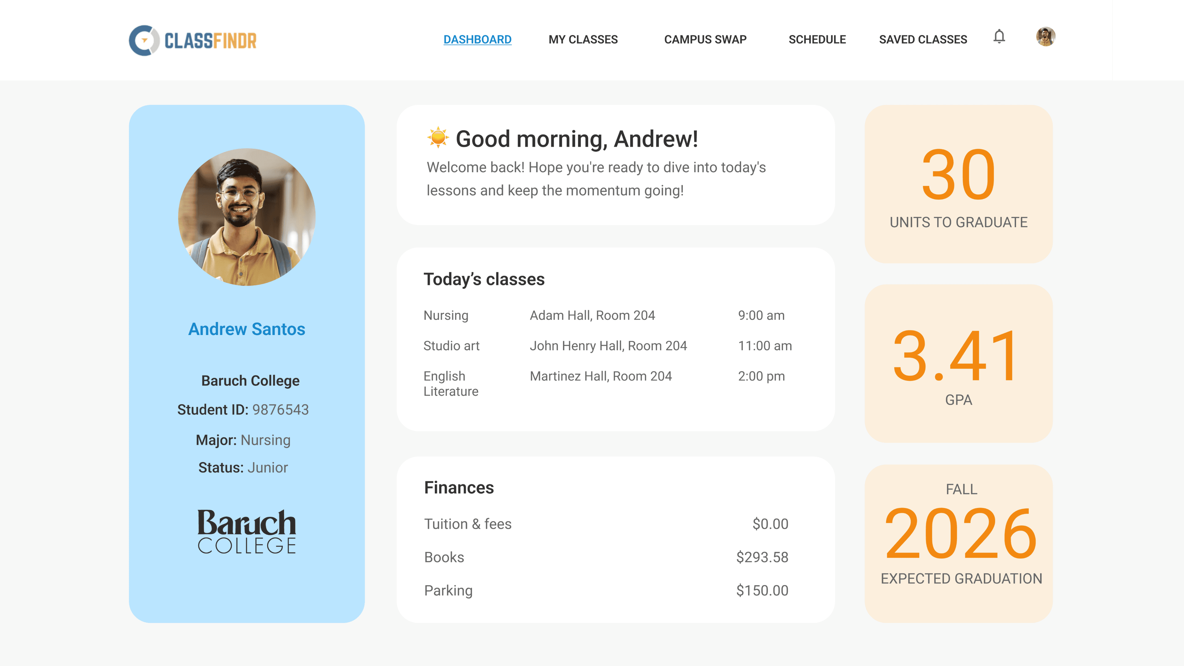
Meet Andrew, a junior Nursing student at Baruch College who also works. His graduation was delayed due to unavailable courses, adding another semester’s tuition. He now seeks more flexible course options, financial aid support, and clearer course planning.
Meet Sarah, a freshman Computer Science major at Lehman College. Though she’s on track to graduate, she faces a packed schedule due to conflicting class times and has to take courses she didn’t prefer to meet requirements. She needs more flexible scheduling, better communication about class availability, and options for classes at other schools.
ClassFindr provides students with conflict-free schedules tailored to their major and semester, plus alternative course options at nearby universities with transferable credits.
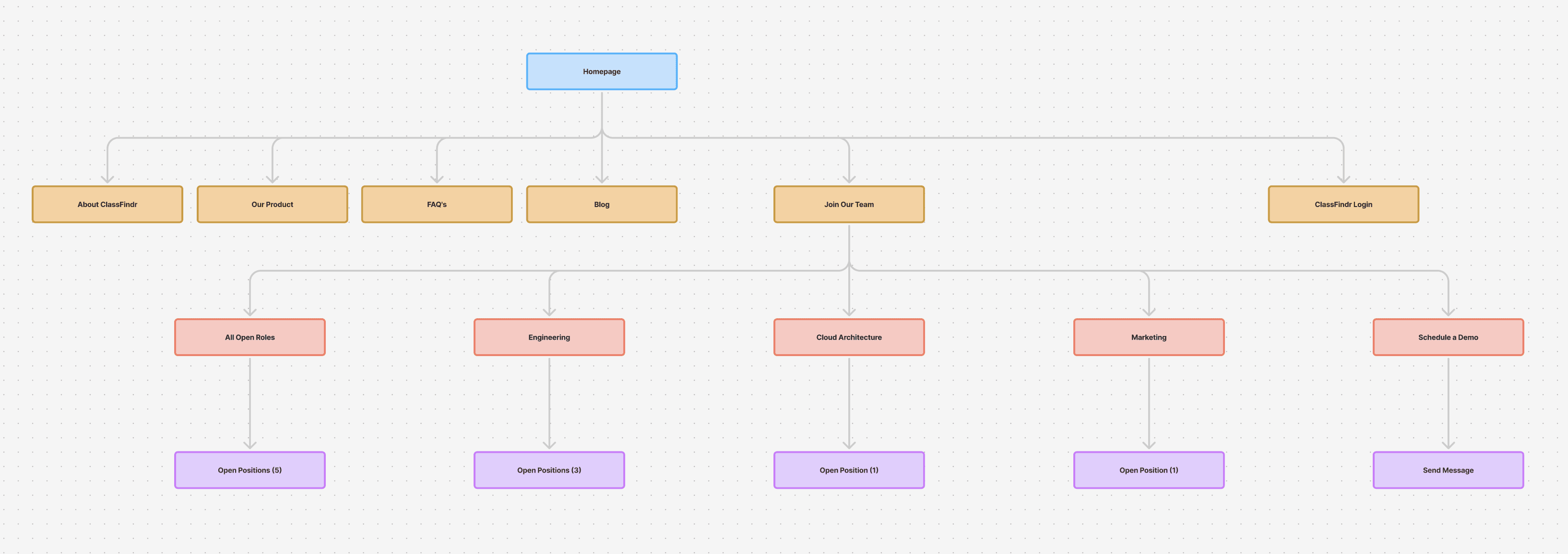
Information architecture
Create a site map to organize where information would live on the site.
Design & Prototyping
Collaborated with team to create intuitive user interfaces and interactive prototypes. Iteratively refined designs based on user feedback to enhance usability and visual appeal.
Testing
Conduct usability testing and gathered user feedback.
Site Map
User Flow
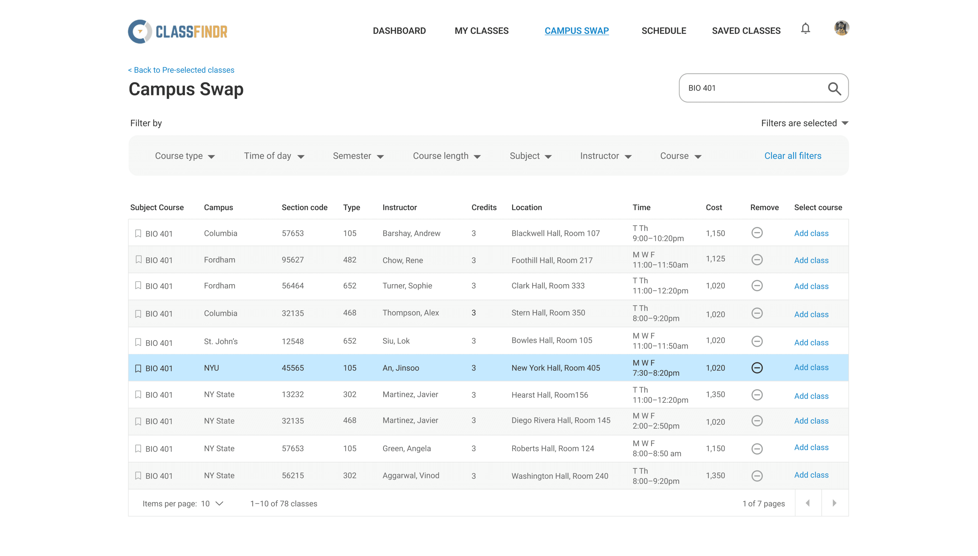
Having an understanding of where we wanted to begin, we all created this user flow that allowed us to picture the user being able to add two classes to their schedule. ART 101 was added successfully to their schedule. However, BIO 401 was not. We thought through the steps the user would take in order to sign up to BIO 401 at a different school and get transferable credits

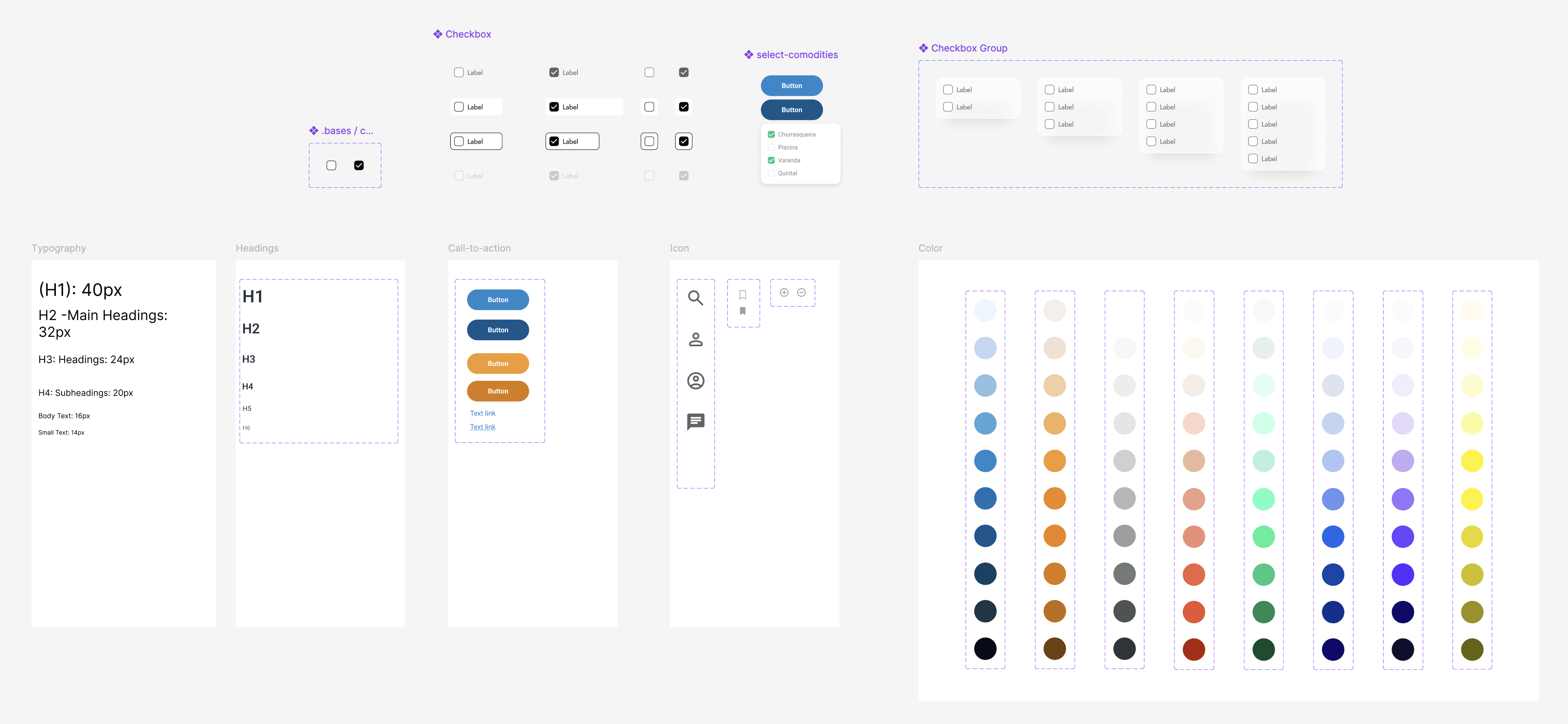
Component Library
The next step was to create a component library that allowed for us to have a sense of uniformity on the website. This uniformity came in the form of the buttons we used, the color schemes we went with, the icons we used, the typography, and much more.
Sketches
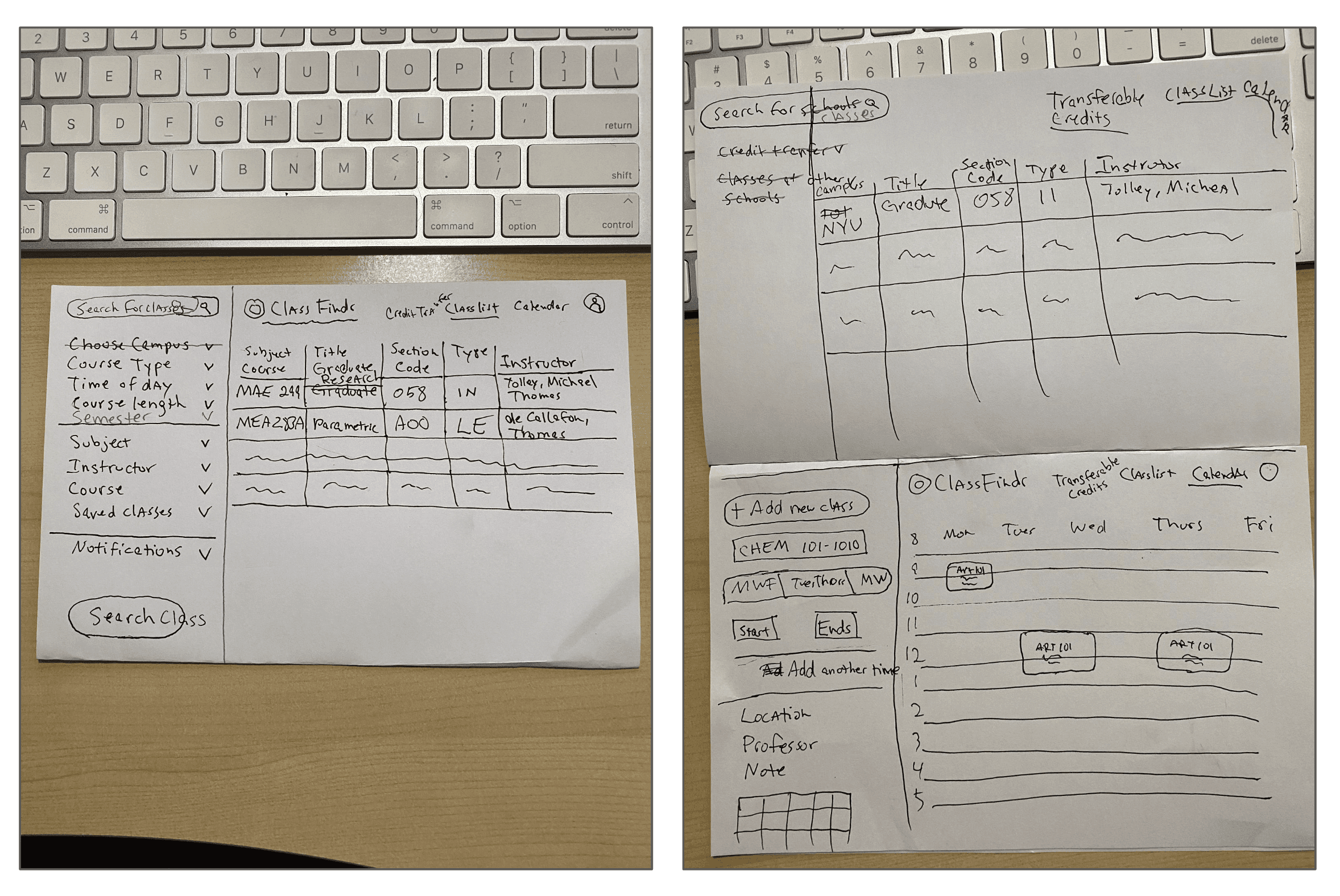
Lo-Fi Prototype
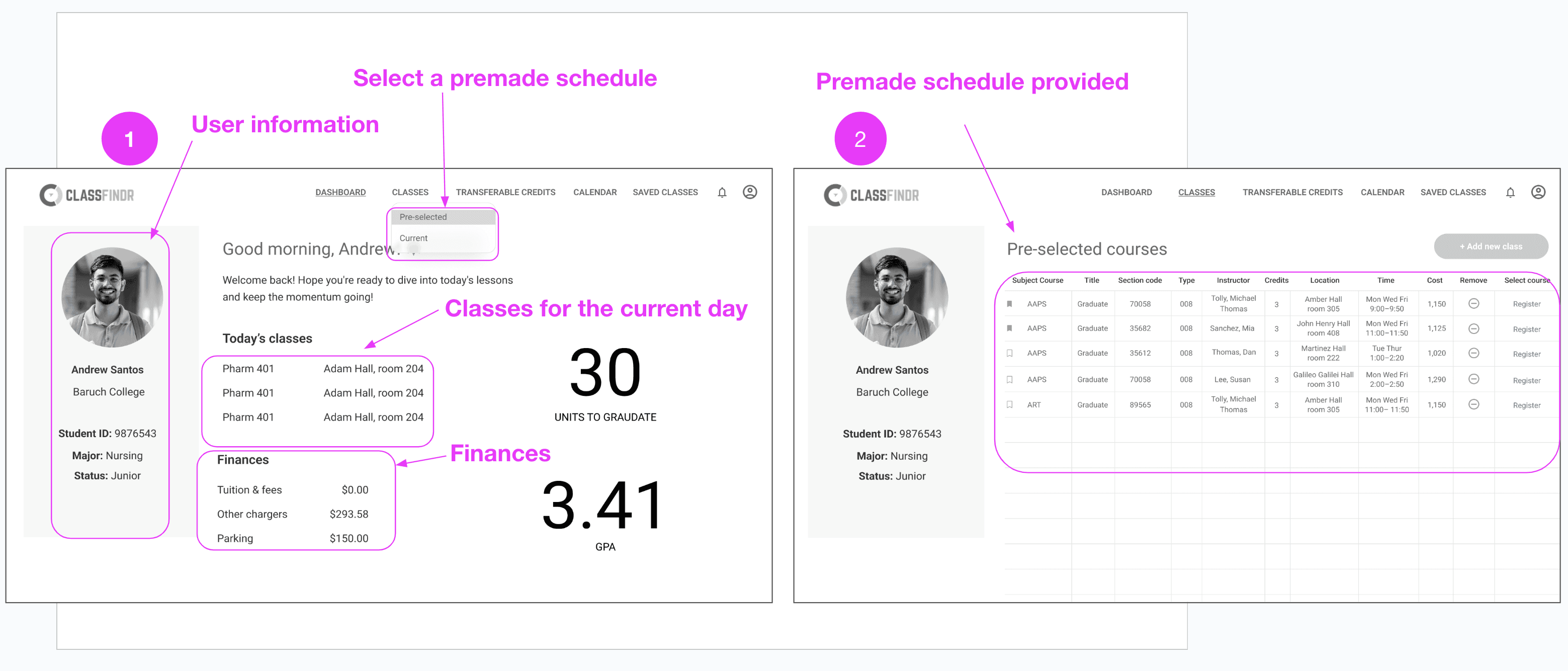
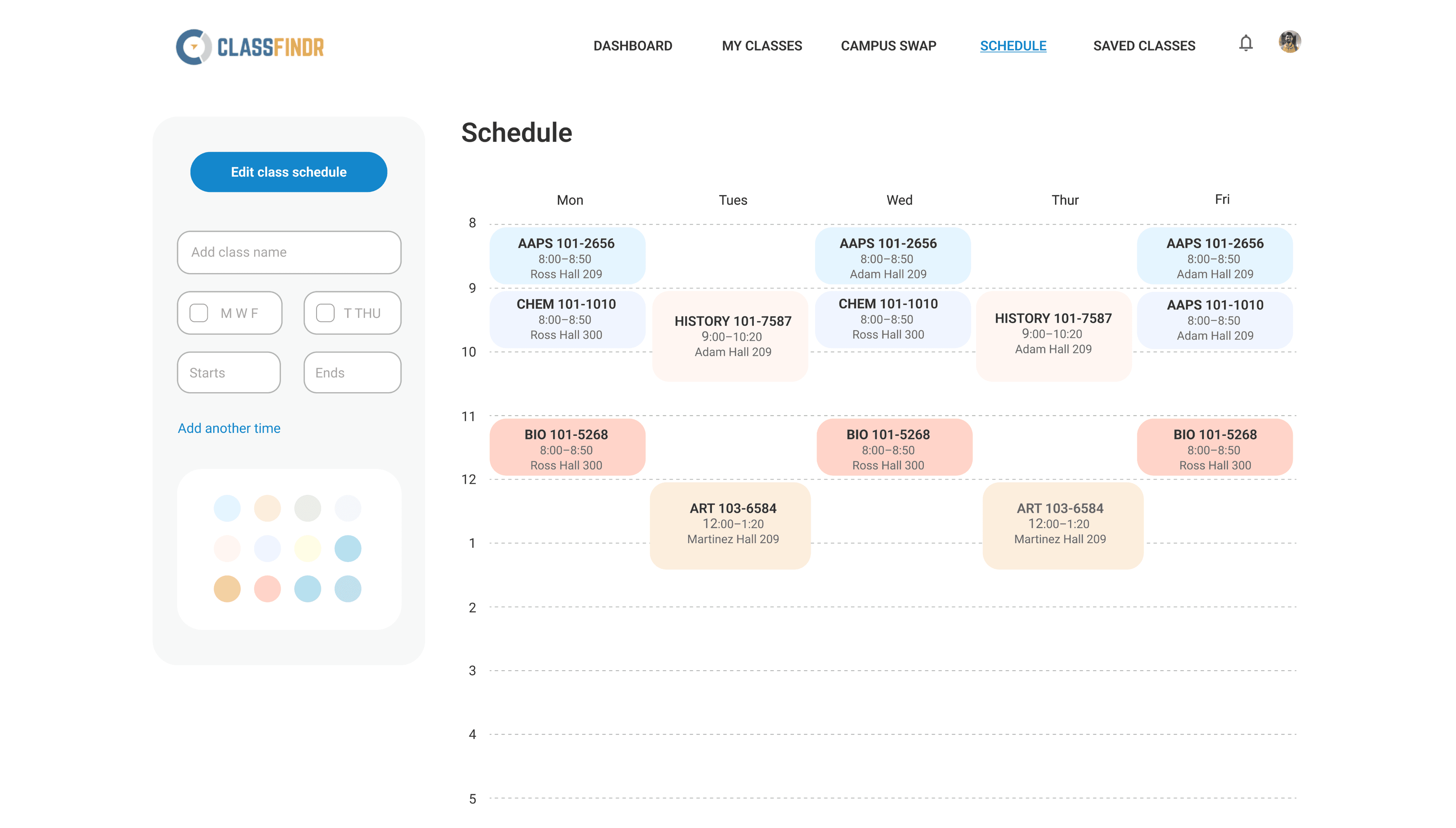
Here you can see two of the many frames in our prototype. In picture 1 you can see all the information provided to the user. They can see their profile information, their classes for the day, how much money they owe the school, and how they can create their schedule by choosing a premade schedule made for them according to their transcript.
Prototype


Here, the outcomes and achievements of the project are highlighted, including user feedback.
Findings
Round 1
Script needed to match the user flow
Change wording in tabs (Classes, Transferable Credits)
Add class times to Dashboard current schedule
Have user add classes to a pre-set selection of 3 courses instead of subtracting classes from a list of 5 courses
Make buttons easily clickable
Add a register button
Show new semester schedule at the end of flow
Round 2
• Fix filters
• Add a total number of credits users need to take
User testing revealed key improvements to enhance usability: aligning the script with user flow, clarifying tab wording, and adding class times on the dashboard. The course selection process was streamlined by allowing users to add from a preset list, making buttons more clickable, and including a “Register” button. Additionally, filters were refined, and total credits needed were displayed to help users navigate and plan more effectively.
Next Steps
• Creating schedules from scratch
• Finish high-fidelity user testing
• Fixing class filtering interactions
• To complete the profile section
• To start implementation